Event
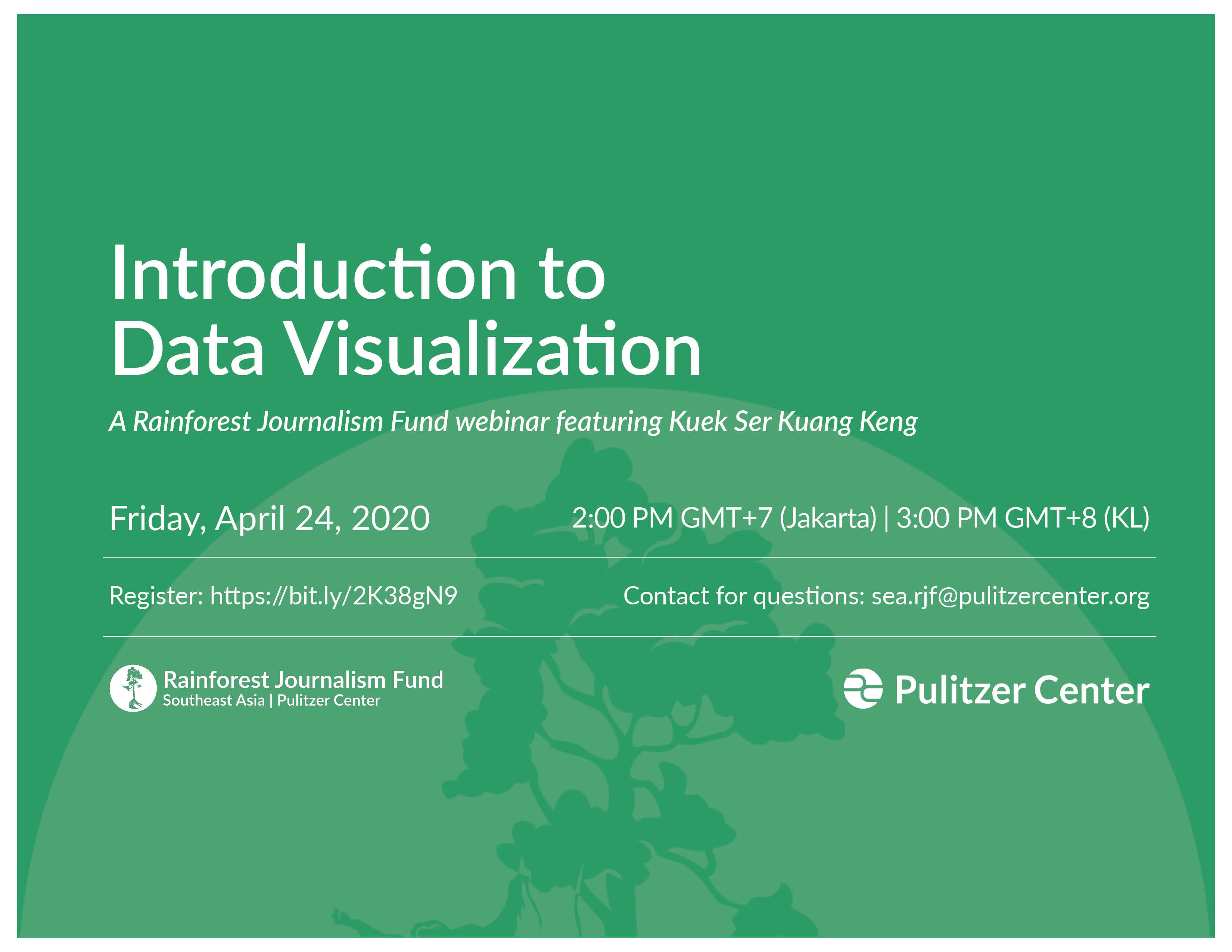
Introduction to Data Visualization (Webinar)
Event Date:
April 24, 2020 | 12:00 AM EDT
The Pulitzer Center's Rainforest Journalism Fund (RJF) hosted a webinar on "Introduction to Data Visualization," which featured Southeast Asia RJF Advisory Committee Member Kuek Ser Kuang Keng. Keng is the founder of DataN, competition officer at Sigma Awards, and former Tow-Knight Fellow.
This webinar discussed how a good data-driven visualization can strengthen storytelling by making it more engaging and easier to understand. It also demonstrated the needed planning, considerations, skills, and tools required for creating a good data visualization. Participants explored the following questions:
- What makes a good dataviz?
- How should one pick charts & graphs for your data?
- How can one use Fluorish (flourish.studio), a free, powerful, and easy tool to produce dataviz?
This webinar was designed for journalists who want to use data visualization in their reporting. The material is for beginners. No programming or graphic design skill/experience is required.
The free, 1.5-hour webinar was hosted in English. While designed for journalists and storytellers, it may be useful to members of the public. You can find the slides and materials from the presentation at this link. To sign up for Flourish (free basic or newsroom accounts available), visit their website (this webinar was not sponsored).
The event took place at 2 pm GMT+7 (Jakarta / Bangkok), April 24 or 3 pm GMT+8 (Singapore / KL / Manila), April 24.


